|
CCR Presentation Link- Click Here Image Cited In Presentation-
CCR Write-up1. How does your product use or challenge conventions and how does it represent social groups or issues?
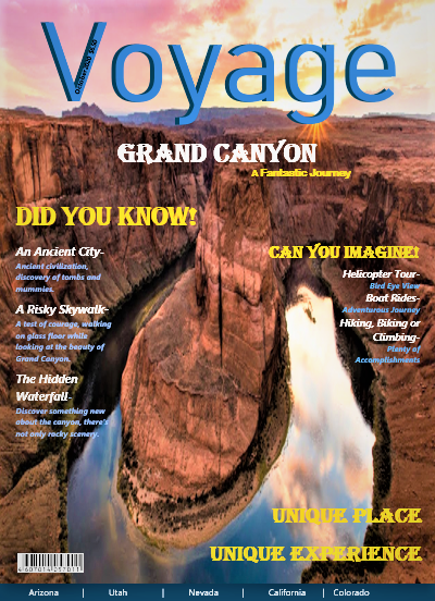
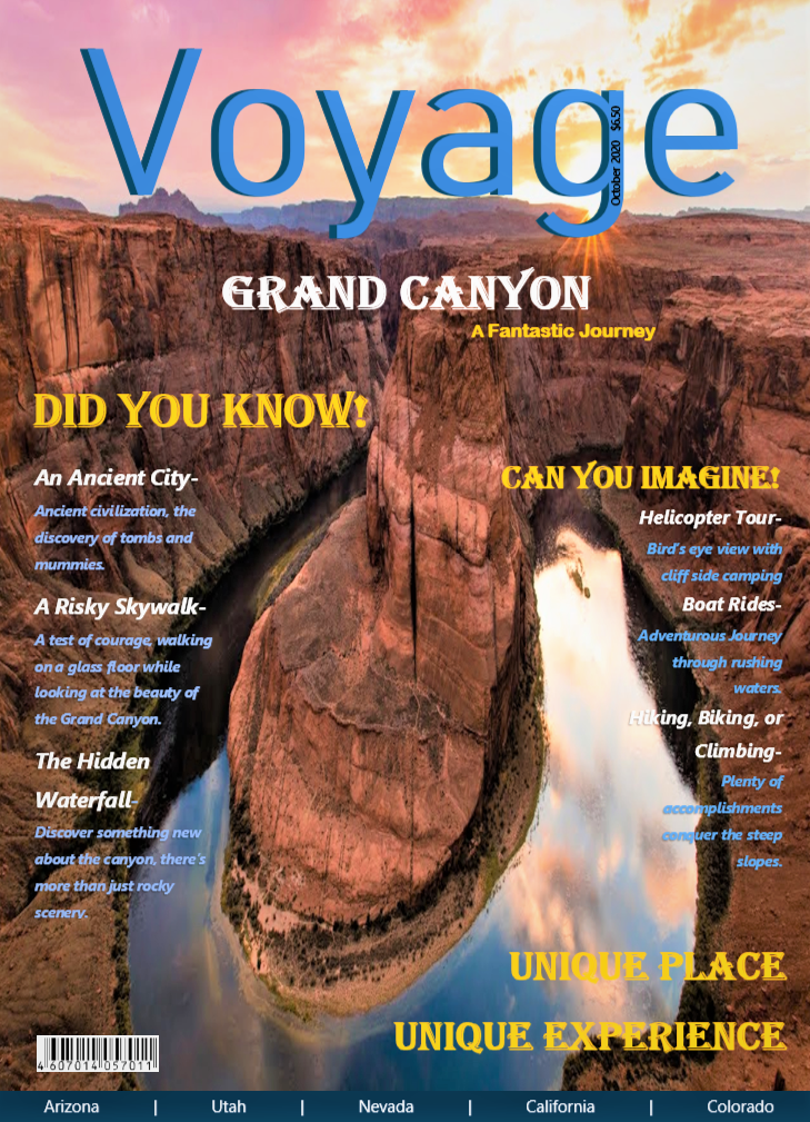
My magazine cover is structure and formatted as a normal travel magazine would be like, I have the masthead, the date, the barcode, etc. Like other travel magazines, I also have different scenery and information about the beauty of the Grand Canyon. The only difference is that my magazine is more informative, and fact-based, I did not include any advertisements on my cover. Magazines are usually filled with advertisements or introduction of amazing hotels or other luxuries. I challenge that convention and use a more informative and historical type of approach for my magazine. The goal is to spread knowledge and uniquely describe Grand Canyon. My target audience is the people who do not have a plan in mind and those are usually families or working-class people who do not want to create a plan. The social group presented in this project is the working class. The working class is usually very busy and rarely takes a break off. This is especially true when society is highly advanced and moving at a fast pace. The issue presented is that the entrepreneurs, engineers, all the people who work tirelessly in their position, have devoted too much of their energy and time to their work. This does not just apply to the people in the working class but families as well, especially the moms who care for their family, children, and career. I want my magazine to be relaxing and slow-paced, they can investigate it and read the fun facts and stories behind the scenery. The articles will be formatted into different small sections so that my audience will not have to have a headache reading a long block of text. For the people who like to slow down and enjoy the beauty, my magazine will provide the perfect plan and list of events for them to enjoy their vacation. 2. How does your product engage with audiences and how would it be distributed as a real media text? My magazine is taking two approaches to the audience. The first approach is that I Include places many first-time visitors may not notice but unique and beautiful. This would let the audience feel surprised every page of the magazine. My target audience is the people who do not have a plan, so including a few unique places and adding some eye-grabbing description would be an important aspect of my magazine cover. It will capture my audience and give them the idea that this magazine has many fun places. My second approach is challenging the content that other travel magazines might normally include in their content. Usually, the magazine would focus on hotels, rides, tours, and places. My magazine, however, use more description on the history of the places and fun facts, it makes my magazine look more informational. Besides, I would like my audience to feel relaxed when they read my magazine; the content will be spread over the pages, making light and easy to read. The cover is also including bright colors that add on with the color of the background, using the word voyage is also getting my audience to explore more about the canyon. The pictures used for every background is also showing a part of the canyon, grabbing the attention of people who has no plan, clearly stating that this is a travel magazine. My magazine would be distributed through bookstores and websites, giving the audience more freedom for choosing their preference. At first, my magazine would be advertised through emails, many customers might have a pop-up of our posts on their screen or advertisements shown across websites. I will also advertise through flyers or brochures; they will have less content, but they can attract customer’s attention and getting more audience to engage with it. All the advertising is used for raising attention and getting the customer to raise their interest in our product. My next step is to display my magazine through websites and bookstores. I can display my magazine in events housed in libraries, distribute them in bookstores or newsstands. They will also be displayed online through my own websites. This way I can create and establish my own brand, leaving the consumers with a deeper impression. I would also attach links on the website so consumers can purchase there as well. The best time for my distribution would be every three months: March, June, September, December. Those months are all correlated with school breaks, since I target families then they will be more likely to travel during school breaks. 3. How did your production skills develop throughout this project? Explain research, using different applications, layout, and design of your magazine or video. At first, I thought creating a magazine cover is easy and all I need to do is to follow the format or the layout. However, after going through some of the videos that explain the different aspects and parts that need to be included in the magazine, it is not as easy as it seems. Even if I put 100% of my attention in my first magazine cover and follow the steps instructed in the video, there are still flaws and room for correction and improvement. During this period, I also learn a lot. I gain a better understanding of the way the fonts should be formatted, the way the color should be arranged, the way how each item is placed, and the importance of the background and image on the cover. There is a lot of things that are needed and pay attention to for making a cover, every detail must go along so that the entire layout will be eye-catching but wouldn’t be too complex that the audience can’t follow. My magazine has three major colors that follow the background, orange, blue, and white, they are complementary colors. I think that not only does it represent the color of the scene but also goes along with the background. I also rearrange the text on the cover so that it is not touching the border and it is lining up and not out of place. I have researched a lot of travel magazines and look through the layouts given on websites like Canva to design my style and how I want it to look. The expectation of my cover is to be clean of advertisements so that it's not covered in bold and a variety of fonts that will make it hard to read. My other pages for my magazine, the table of content and the double-page spread for the article, are similar in design. They all used pictures as the background and no white spaces on any page. The pictures are all blown up grabbing the audience’s attention at first sight. Throughout the process of creating the pages, there was a lot of trial and error. I have posted many other designs that I have produced and improved my skills for doing numerous layouts. Google search is a great tool in this project. It is only helpful for searching for common and popular layouts used for real travel magazines, but also an effective way to gain an understanding of the layout and format. Looking at all the examples of the cover, content, and article, I have a clearer image of how my magazine should look like. It gives me inspiration. Furthermore, the applications used are simple in this project. However, my production skills did improve after practicing and creating different new ideas for the article and table of content on Canva. I was able to construct the magazine more fluently after many trials of deconstruction and reconstruction. My skills also improved because I have been researching about creating a magazine, things to look out for, things to include, and ideas for creating magazines. There are some helpful videos and examples on YouTube and online. 4. How did you integrate technologies – software, hardware, and online – in this project? In this project, I was shown and exposed to much new software that can help me format the magazine cover and structure of the articles, table of content, etc. At first, Microsoft Word is enough for me to create a cover, but there are many inconveniences and flaws when I upload it on canvas. The picture is not looking right when I download it or the text boxes for the contents must be arranged by hand to align them. So, I turn to other software like Canva and Adobe InDesign, they have much more tools and they have been a better tool for layout and designs. They will not get the article or titles all over the place. Canva can also allow a lot of layouts for formatting my project, I was able to combine a few layouts and create something new to fit my design. I was also able to upload my pictures taken from my last trips and the ones search on the internet to incorporate them in my project. Canva is a great tool for creating the final product and it's easy to download and upload on both canvas and my blog. This process is all done on one computer, it is the only hardware I use and it really is a better choice than editing on the small screen of a phone. Overall, Canva is a great tool for finding different templates and emerging them, constructing them, and formatting the layout. It is used for all parts of the project and it's especially useful for tuning the picture to the right color. Microsoft Word has a lot of issues in the process of making a cover on a word documents, but after downloading it into the adobe in-design, it's much easier. Adobe- In design is only used for correcting the cover page, which is done primarily on words. It is a great tool to make everything in place.
0 Comments
  Before I upload the first copy, I had other ideas of laying the text and the pictures out. However, they didn't come out as well as the first edition. Those are only some attempts and tryout for my double page.
 Compared to the second revision that is darker and dull, this copy is adjusted to be more colorful and bright.
  The changes to the double page spread is mainly on the font style of the text and title. Some of the titles are repositioned and moved so that it doesn't look too cramped. I consider on doing some changes about the text and picture on the second page in the next revision, so that it can look more fluent with the first page and not so colorful and cramped.
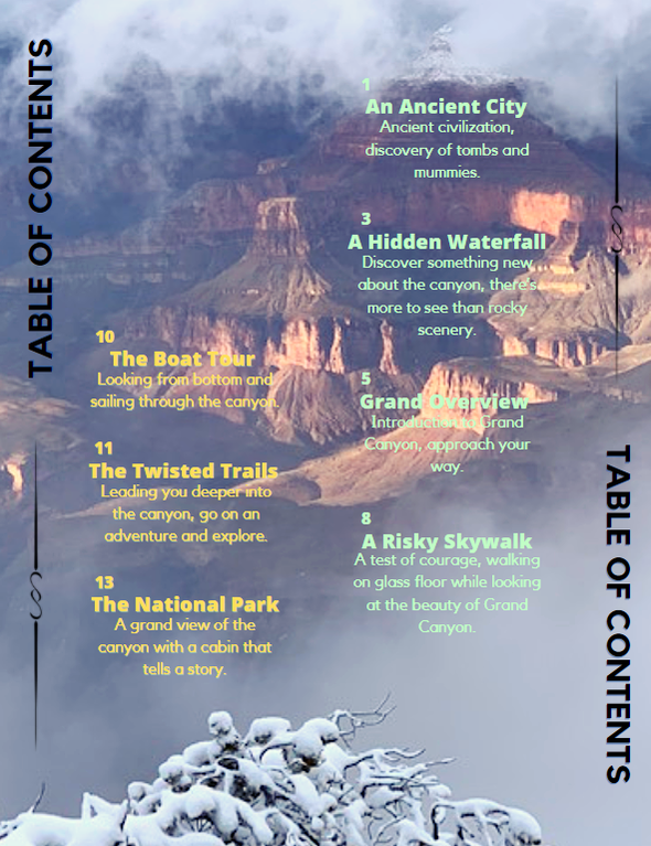
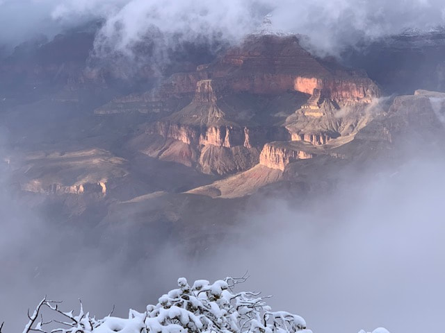 I have decided to use this picture as the background for my table of content. Not only does it solve the problem of the pictures mentioned before, but also it lets the reader see that every page of the magazine has a similar element. This would be the background, every page has a picture blown up for the background making the pages colorful and memorable. This picture was taken on my previous trip to the Grand Canyon in winter. I think this kind of picture would be very interesting and realistic for the reader to see the Grand Canyon in Winter. Although the clarity is not high but the beauty can still be seen.
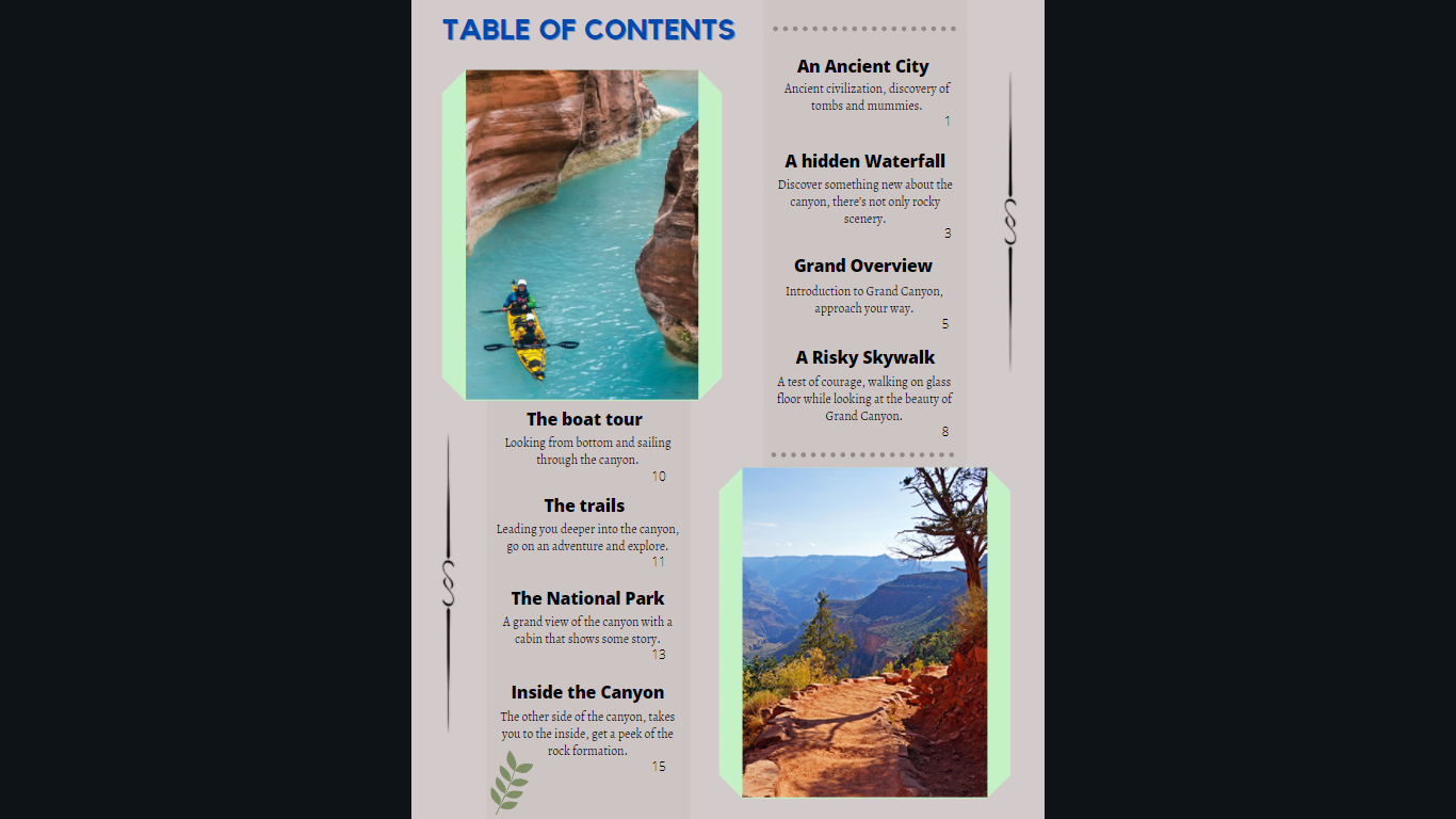 The new revision includes borders around the pictures and added a little designs to the sides of the content. The purpose is to add a border so that it doesn't look empty but it is also used so that the audience can direct their attention to the content. the background is also made a little more transparent so that the TOC can stand out. The picture may be a little out of place so there might be more changes to it.
|
 RSS Feed
