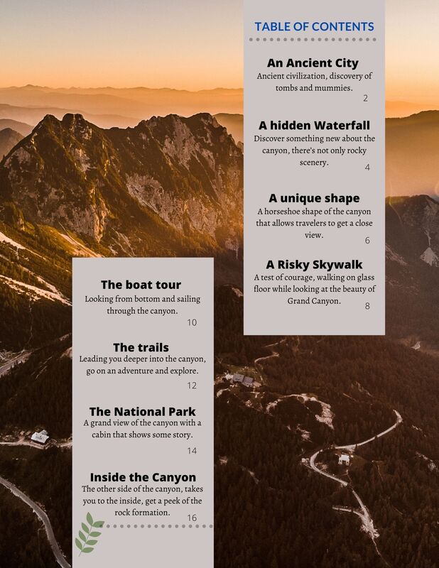
 It does not challenge convention; I used a template online and simply added another column to it. The difference is very minor, and I just replace the font and the layout, so basically it is reflecting the template. I am sure that there is similar TOC in other magazines that are like mine, so it doesn’t challenge conventions. My magazine concept is adventure, to explore something new. The targeted audience is travelers and families that needs some tips on their vacation. So, the theme color is blue, yellow, and orange, the color of the Grand Canyon. I want my audience to learn something new about the canyon when they look at my magazine. However, my first magazine TOC is not appealing to the target audience, I am lacking harmony in the color, the text and the background stands out, but it looks out of place with the picture. My layout needs to be clearer and refresh. In general, I do not think it is good enough, I do not think my target audience will be attracted. Since my magazine will be distributed digitally, I think that the TOC should be better than this one. With all the devices, I should be able to present a better version of the TOC.
0 Comments
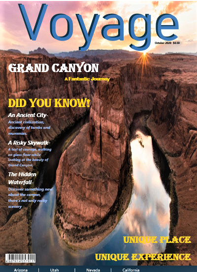 The texts at the left are moved in so that it doesn't touch the edge and the two phrases at the bottom are move to the right, to make the words line up. Compare to the first copy, this version fixed some little problem that should be avoid for magazine covers.
|
 RSS Feed
