  Before I upload the first copy, I had other ideas of laying the text and the pictures out. However, they didn't come out as well as the first edition. Those are only some attempts and tryout for my double page.
 Compared to the second revision that is darker and dull, this copy is adjusted to be more colorful and bright.
 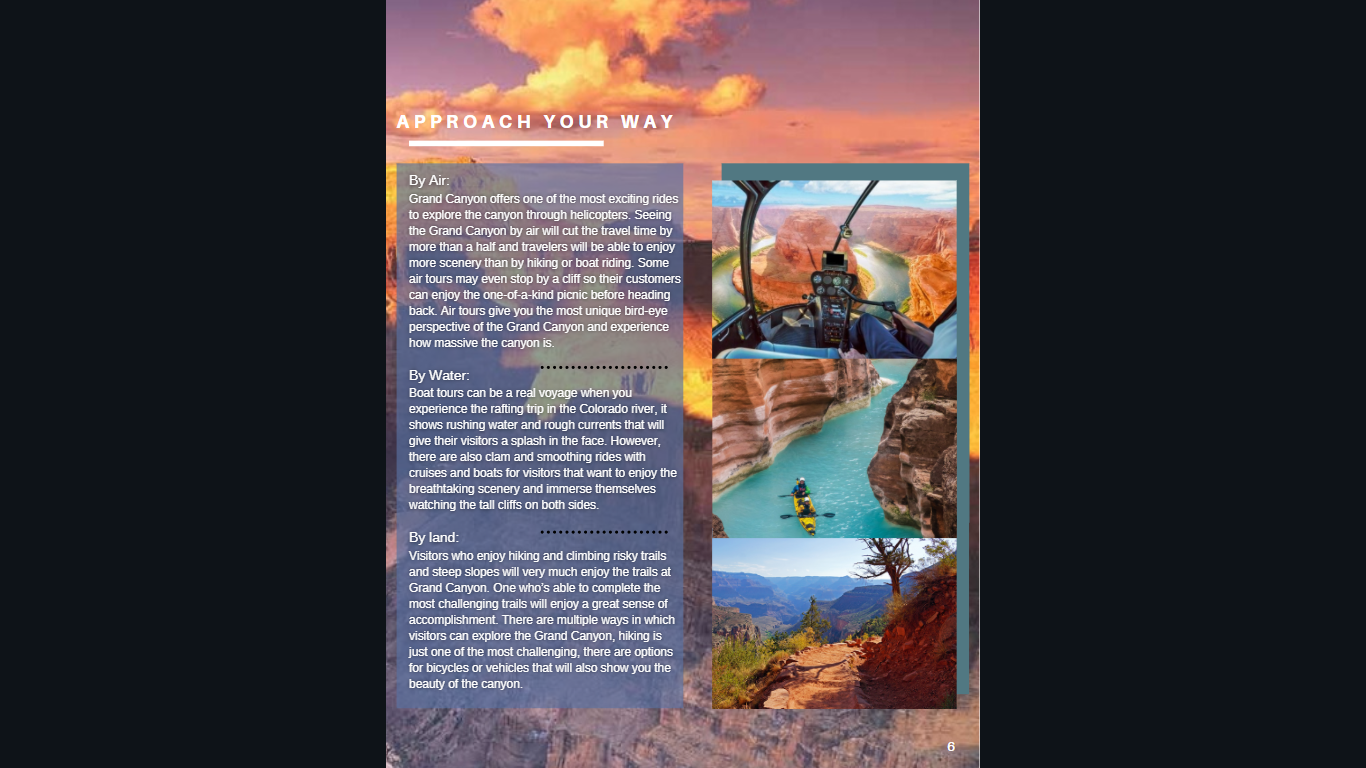 The changes to the double page spread is mainly on the font style of the text and title. Some of the titles are repositioned and moved so that it doesn't look too cramped. I consider on doing some changes about the text and picture on the second page in the next revision, so that it can look more fluent with the first page and not so colorful and cramped.
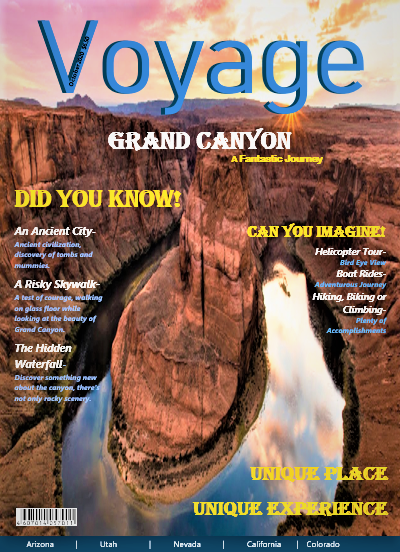
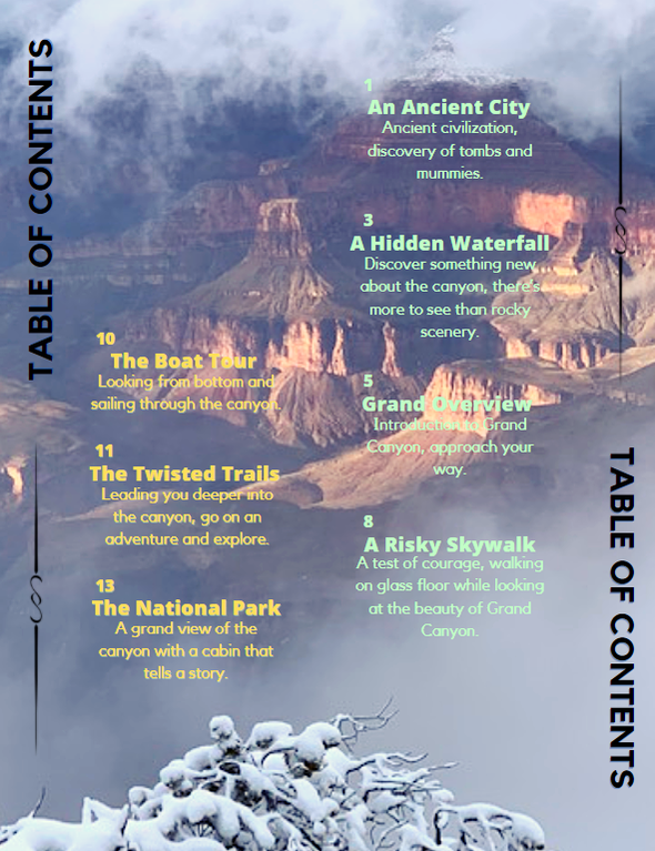
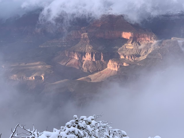 I have decided to use this picture as the background for my table of content. Not only does it solve the problem of the pictures mentioned before, but also it lets the reader see that every page of the magazine has a similar element. This would be the background, every page has a picture blown up for the background making the pages colorful and memorable. This picture was taken on my previous trip to the Grand Canyon in winter. I think this kind of picture would be very interesting and realistic for the reader to see the Grand Canyon in Winter. Although the clarity is not high but the beauty can still be seen.
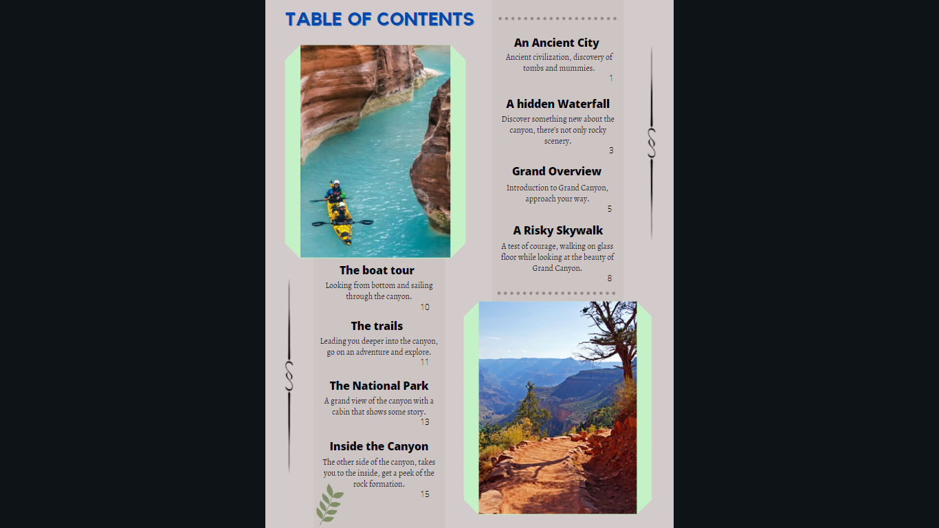 The new revision includes borders around the pictures and added a little designs to the sides of the content. The purpose is to add a border so that it doesn't look empty but it is also used so that the audience can direct their attention to the content. the background is also made a little more transparent so that the TOC can stand out. The picture may be a little out of place so there might be more changes to it.
|
 RSS Feed
